
Hello, I'm a bit late to respond, but you don't have to hold down the right mouse button to start scoped! You can click once to scope in, then click again to scope out.
BoboNator
66
Posts
A member registered Feb 15, 2021
Creator of
Roboswitch is a puzzle game about three robots working together to reach the goal.
Puzzle
Play in browser
Recent community posts
I really enjoyed this! It took me a while to get used to, but once I did I found a good rhythm. It was a stressful trying to upgrade my towers while I slowly ran towards death.
I wish there was more info about the different types of towers. Maybe a list of their symbols and what they are in the tutorial would be great. I was very confused when I first started buying towers (and had very little time to do so before my runner died) because I didn't know what anything was.
This was a fun puzzle game! I didn't expect to enjoy it as much as I did. The core mechanic is great and lends itself to a variety of puzzles. I giggled with delight the first time I started moving around as a headless body and hat.
For the most part, the level design and pacing is well done. The new mechanics (hay bales, teleporters) are introduced at good times to keep things fresh, and you get good mileage out of each concept. I particularly liked how I had to have a certain shape in order to use the teleporters. There were only two levels I didn't like as much:
- I personally think the first level that uses stacking is harder than the following level.
- The last level looks messy with the huge number of teleporters. Adding more space could help with this.
The visual design of the character and individual elements is nice, however the scaling feels off. On the first level, I was confused why I couldn't continue walking upward, because the shape and scale of the trees didn't suggest to me that they would block my hat. I actually thought I was running into an invisible wall at first!
The input feels slow and sometimes unresponsive.
The in-game tutorial text is clear in meaning, but needs polishing in terms of appearance. A better font and a background would be great.
The music contains good ideas and matches the wizard theme, but it's too repetitious. I don't think you can get around just simply writing more music, but I have one idea that will help. Right now, the loudest sound is the bell. The problem is, it's the most constant and repetitive, and therefore boring part. By comparison, the melody (changing, interesting) is almost too quiet to hear. If you switch these two volumes around it'll instantly sound cleaner and players can listen longer before getting annoyed.
Overall a cute, fun game only in need of a few bits of polish!
This was a creative idea! I loved how the puzzle-solving and story-telling interlocked. I also appreciated that each options' dialogue changed depending on what I had already chose, particularly in the first puzzle.
I was a bit confused by the direction "in this order." Does this mean I chose a color in the correct position, or that two events are correct relative to each other? For example, I punched the bully sometime after blocking a hit, but is the 2nd, 3rd, or 4th position correct? After playing through the game, it seems like its the first option, in which case I think the text "~ events happened at the correct time" and "~events happened, but not at the correct time" would be more clear.
The first and third stories have a great color code, but the second story was particularly frustrating because I couldn't remember what color matched what action. Having a key on-screen, or using different icons (e.g. a fist, crossed arms, etc. instead of colors), would be immensely helpful. I had to look at the walkthrough for this story, and only then realized that walking out was an option. I think if there was a key, and the "in this order" text was clearer, I could have gotten to three correct events and then explored to find the fourth one.
Another possibility would be to include a version of Grandpa's fighter sprite walking left and turning his back on the bully, possibly with his arms down. This would let players know that it's something they're expected to do, and encourage them to walk all the way off-screen.
This is an adorable game. I can see myself returning to it for a bit of relaxation in the future. Was Viridi by any chance an inspiration?
The pixel art is wonderfully done. I had fun trying out different arrangements of plants. The music is also very relaxing, but the loop could bit a bit longer so it doesn't get stale as quickly. The sound effects are nice, but in my opinion the "cut" and "compost" sounds are too loud relative to everything else.
I like the idea connecting to the "Failure is Progress" theme, but gameplay-wise it falls short. I think it would be more effective if you had to take care of the plants by watering them, but could choose to let them die in order to get nutrients. However, if you implemented this I would like an option to enter a sandbox mode so I can place my plants freely without worrying about them :)
I like that I can see the space taken up by each plant when I'm about to put a new one close to it!
You have a nice start with the visuals, variety of plants, and basic mechanics. With a few upgrades to the systems I could play it for much longer :)
When I was a kid playing Minecraft, I remember not having a clue how to get redstone gates to work properly. This was a fun puzzle game, and I learned something from it!
The visual design is wonderful, and I love the help animations that describe the different gates' function. It's simple, cute, and helpful!
The sound effects are well done, and so is the menu music! I'd like to hear the music during the game too.
The two gameplay stages - free exploration of the level as a ghost to see its workings, and acting on it as the live robot - interact in a fun way. If you were to keep working on this game outside of the "fail to progress" theme, however, I'm conflicted on whether I would recommend keeping the death requirement. On one hand, requiring the player to die initially is just an extra, unnecessary step. Being able to press a button to view the whole level at once would be much easier. At the same time, when playing through a level, it's nice to get immediate feedback on your surrounding area when you die.
When I first learned about the invisible spikes, I was a bit worried because I've played a few other games with this mechanic that were just frustrating. Luckily, they weren't over-placed in this game and didn't cause too much annoyance. Still, I would prefer them being permanently visible. Over the (NOT) Gates shines as a logic and puzzle-solving game. Requiring the player to memorize spike positions on top of that is just an extra burden that gets in the way of the true fun.
With a few small changes and more levels, I would love to keep playing this game! The basic gates have been introduced. Now what kind of crazy levels can you make using their full potential?
Your game has a really cool core mechanic that's fun to play with! My biggest complaint is that I wanted to play more levels, and the included ones weren't very hard. The game's icon led me to believe I would have to use 4 copies of myself to complete puzzles, but the most I had to use was 2.
I love the visual design of the character, especially the different colors that appear for each time loop. The way he holds his gun seems a bit weird though.
The sound effects and music are well done!
Some other reviewers have mentioned the polish they want to see, but here are some features I found myself wanting while playing:
- A button to kill myself so I don't have to wait for the timer to end.
- An in-game menu or level select screen. When searching for a kill button, I pressed escape expecting to see a menu but exited to the main menu. I had to play through the first 4 levels again to get back where I was
- A clearer UI. I understand the red bar was health, but I wasn't sure what the second row was supposed to represent. Sometimes it had two icons, and sometimes three. Was the the maximum number of loops for the level? I also noticed that when you went through a time loop the new characters' colors appear underneath you, but I don't think this is necessary.
Overall, there's a great foundation for a game here! I enjoy puzzle games, so I'd love to play more of this if you add polish and levels!
Bug Simulator (Wowie GameJam 3.0) jam comments · Posted in Bug Simulator (Wowie GameJam 3.0) jam comments
This game had a creative premise and also an interestingly designed UI. Gameplay-wise I think it has a lot of potential, but this version of the game seems to never really gets started. The levels are too easy and don't have much variety, but serve as a great introduction to the possibilities these mechanics can lead to.
I appreciate that the tutorial took things step by step, but it felt slow and by a certain point I just wanted to get to playing the game. The first few were levels were unnecessary, because I had already figured out the basics by fumbling my way through the main menu (which I have mixed feelings about, because its really creative and matches the controls of the game, but for someone who just started it up there was no indication about how to get things to work).
Bob is a cute character, but when he showed up I was annoyed because I had just finished the tutorial, played one level, and was already locked into reading more expository text.
I think the game's weakest point is also where it is most unique. The visual design is thematic and creates the "buggy computer" atmosphere, but the
- Grain effect
- Scrolling horizontal line
- Zoom-in effect cutting off the corners of the screen
- Strange font
all combined made it very difficult to read and look at. I think a cleaner UI could still convey the game's setting without being so hard on the eyes.
The sound effects were great, and I liked the background music. Good job!
There were a few typos, but nothing major.
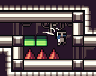
My favorite level was when I had to cross the wall of red triangles to touch the goal. I would be interested in playing an expanded version of this game where each level has a challenge like this that requires bugging the game in a strategic way, instead of mindlessly moving the commands to different controls until I have done every bugged combination.
Ghosty's character design is SO cute, and I love both the music and the speech sound effects.
I like the idea of the gameplay, and I like being able to see the paths of my previous lives instead of just the boxes they hit. However, there's a few flaws in the execution of the levels and mechanics.
The first 6 levels are pretty straightforward. Around level 5, it was getting stale and I didn't want to continue playing. However, the simple addition of the moving edges in level 7 did so much to revitalize my interest in the game. The double jump mechanic introduced in level 8 did the same thing. Suddenly the game felt like it required skill instead of lucky guessing. One-sided platforms like in level 10 added more interest. I think these things should have been added earlier.
I like the double-jump idea, but with it several frustrations were introduced. First, the way Ghosty accelerates when he jumps makes the double jumping feel extremely inconsistent. As I spent more time failing the same double jumps, it was frustrating to finally clear them and then have to complete a lengthy level by guessing where the remaining blocks were. Another issue is that after being on a level for a while, some of my ghosts stopped showing blocks I had previously hit. These three issues together meant that by level 10, my gameplay experience looked like this:
I fail the same difficult jumps multiple times. I finally pass it. Then, I run into a block I've already hit before but my ghost stopped showing it to me OR I have to start the trial and error process of dodging unseen blocks. I hit one, and restart the process.
I kept playing because I wanted to get Ghosty to thier party, but ultimately I had to quit at level 10 and watch a playthrough someone else had posted. After putting so much effort in, I was disappointed to find out that there was only a vacuum waiting for him.
Overall, the game has a simple but good core idea. With some cleaning up, mechanical fixes, and variety earlier on, it'd be a much more enjoyable game.
Edit: I forgot to mention that the camera moving up and down to follow Ghosty was a little disorienting. Since both edges stay in the screen's view the whole time, I don't think the camera needs to move at all!
This was a fun idea! The VP makes me nervous by constantly glancing at me with those beady eyes. I like that you have to read each bill and think about whether it's good or bad for you. I would like to see more variety, as even in the first day I saw the same bill repeated many times. Eventually I didn't have to read them, but just remembered which ones were good and bad.
I personally think the game goes on too long, both in terms of the time in a day and number of days. With the heart system, if I lose the first two early in the day, I kind of just stop playing in order to avoid losing the third one before the end of the day. Then the day just dragged on while I waited. Signing good papers while the VP watches makes him less suspicious of you, but maybe it should also increase your hearts too so you can keep playing at a faster/riskier pace.
It took me a couple of tries to reach the end of the first day, and unless there was new content or fresh mechanics I couldn't see myself playing until the end of Day 5.
The design of the office and chosen models are nice. The path the aides take around the desk to come in and leave is pleasing. I would like more sound effects, particularly one that alerts you when you've been spotted and lose a heart.
I've always wondered why my cats knock things off tables and shelves. This was an adorable little insight into their minds!
I liked the small little details that were put into the game, like the cat running faster when they're on fire and hissing when you swipe at the guard.
While I liked the humorous presentation of the objectives, my biggest complaint is actually how hand-holdy the objective system is. I think I would have had more fun exploring what kinds of things I can destroy on my own rather than being told what to do. Bigger things, like destroying the window and shooting the cannon, could have in-game clues to suggest that those things are possible.
I felt kind of worried destroying things before I was supposed to, because when the game started, I immediately knocked a glass bottle off. Later it became an objective, but wasn't marked completed. I thought I had already broken the game by doing things out of their "set order" before noticing there were more bottles.
The sound effects were good, and I especially enjoyed the music! The composer effectively created an exploratory/mischievous backdrop to knock things over to.
I noticed one bug, and that's that in the house you can jump through the furniture on the right side of the room.
This was a very cute game! I enjoyed it :)
I never thought I would be so scared of a few high-speed, floating A's.
In my opinion this game fit the theme of the jam perfectly. Dying isn't necessary or forced upon the player, but still provides helpful information for future attempts to navigate the maze.
The minimal visual design is nice in its own right, but I think the lighting is truly wonderful. Being able to see just far enough around myself lead to many intense, heart-pounding moments as I raced towards the exit and could see enemies flying past or chasing me just on the edge of my vision.
The most exciting moments for me were when I could spot an enemy passing one of my lamps, guess their position, just barely juke them by suddenly changing my path, and then race to the exit taking many twists and turns before they could catch me. In general, the level design facilitated these exciting moments. There were many alternate paths to take, and while some turns took my to dead ends, most of the time I was able to keep twisting around corners without worrying too much about taking the "correct" path.
The exception to this was the last level. It seemed like, in an effort to make it harder, there were more dead ends and several long corridors with no alternate exits that made it easier for enemies to trap me. This felt kind of frustrating. Having the freedom to move around in the previous levels was much more fun in my opinion.
The sound effects fit the visual theme, but weren't too special. I thought briefly that adding a sound to indicate approaching enemies could increase excitement, but I realized I actually liked the surprise of seeing the enemies appear in my vision unannounced.
I hate horror games and jump scares, but overall I loved playing Beacon of Light. Good idea, and good execution!
By the way, I'm curious how you programmed the enemies. It seemed that at the beginning of my life they would ignore me, but the longer I lived the more they would hone in on my scent and chase me down. Is that true? Also, sometimes I saw a small red circle drawn on the ground. What was that?
You did really well creating an atmosphere and telling your story through the environment. In the short 3 minutes it took me to walk through this, I felt fear, wonder, and awe.
The visual design of the spaceship is well done, but the motion blur was a bit much for me. My favorite part of the game was the inside of the black hole. The spiraling colors not only looked aesthetically cool, but changed my mood from "oh crap I didn't escape" to "ohhh, where is this taking me?" My favorite game of all time is Outer Wilds, a game that filled me with wonder, and I felt some of that wonder again during the short experience of Event Horizon.
The sounds are well done and fit the setting. If I nitpicked one thing, it would be that the door opening sound got a little too high pitched and loud towards the end of its duration.
Great job!
When I typed this, by the dialogue I meant typos and grammar mistakes, but now that I've loaded the game and read the opening dialogue again I realize that it was purposefully done for Odin. I didn't realize that the first time, sorry! I think the rough speaking style paired with the "?!" left a messy impression on my mind. This is extremely nitpicky but I don't know if "!?" would be better or if it would just like neater with a simple "?" Line breaks after sentences and a bit wider text box to fit it all might help things look cleaner too.
Now that you mention it, the writing does feel pretty unnatural. For some reason I'm really hung up on Loki's use of "cannot" instead of "can't." This has devolved into excessive nitpicky-ness though. Just in general, if you spend more time on the game I would suggest revisiting the dialogue scenes. Sorry for the confusion!
This game has a great concept and was a lot of fun! I'm a fan of city builder games, so to take the opposite approach and actively destruct a city was interesting.
The levels are designed well and the difficulty ramps up at a nice pace. I like that each new power is introduced on a simple level, and its strength can be easily figured out without the need for a text explanation. I particularly liked the last level, where I had to coordinate my three powers. It showed the game's potential as a strategic/puzzle game.
While playing the first few levels, I would have appreciated info being shown on what a building was when I moused over it. I wasn't sure what the function of the two fish-related buildings were. However, as I played more things made sense. I like that each different type of villager is distinguishable and doing some simple observation teaches you about their behavior.
I was a bit confused by the level of polish, because some things were really well done, like the character art, and some things could have been easily fixed, like the dialogue text.
With a bit of polish and additional sounds, you would have the base for a great game here. Good work! The potential buildings/powers you can add are seemingly endless. I would love to play more levels!
I love the small details in this game. It starts right on the main menu with the box being tossed around in a loop. There are the working sound and music sliders which FEEL good to adjust. The exits matching the robot's shape and him plugging in to charge. The controls being explained on in-game monitors. The writing on the walls. All of this polish makes the game feel great.
As a keyboard user, my one complaint is I would like another button added to select menu items, close to WASD so I don't have to bring my second hand to the keyboard for the sole purpose of hitting enter.
The visuals of the game are beautiful and communicate the elements of the levels well. The robots eyes help him stand out, and I like his shut-down animation.
The music was lovely, and is set to a good volume relative to the sound by default. It sounds like a short, simple loop, but I never noticed it getting old or annoying. The music on the last level was a jam, I wish there were more levels so I could keep listening!
You have the solid foundation of a great game here. Good job! Now just add more levels, and maybe a few more mechanics to give yourself fresh level ideas to work with! I'd love to keep playing :)
Text adventures aren't really my thing, but I gave this one a try! Here are my thoughts.
In a game like this, the text is (obviously) very important, so it needs to be as readable as possible. Things like typos and run-on sentences aren't a big deal by themselves, but in a game entirely based around reading, every time the reader has to pause is a brief moment of annoyance that builds up. Even something as small as making sure each sentence has a period can help readers' understanding as text is flying by on the screen.
I greatly appreciated the ability to change the text delay, but thought the text should have been bigger. I zoomed in on my browser though, so this wasn't a big deal.
I personally would have preferred more blank lines to be added, particularly when changing between dialogue and actions. It would greatly help with readability.
I appreciated the way the altars and respawning tie-in with the theme. I liked the idea of getting different blessings/weapons each life. However, I would have appreciated a counter or something letting me know how many altars are left. I also think regaining your items is bugged, as many times the game told me I found my body and grabbed my stuff, but my items never reappeared in my inventory.
The combat system is kind of...meh, to be honest. First of all, every enemy encountered (besides the prologue and the boss) are succubi. By the way, they are all referred to as "him." Is this an error?
There also isn't any challenge in the combat. After the first two combats I just lowered my text speed to 1 and spammed my strongest weapon. I'm not sure if my weapon choice mattered though, because it seemed like everything I had did 20-30 damage. Enemies increase in HP, but don't actually offer any more meaningful challenge. I dodge most of their attacks, so I just have to spam the combat button a few more times. Because of this mindless loop, the blessing system felt pointless.
My suggestion to improve combat would be to implement different enemies that are vulnerable to different types of attacks. Maybe even single enemies will take different stances in combat which require a different attack to counter?
The text of the prologue felt like it could be trimmed and cleaned up a bit, getting the player into the action sooner, but I'm not really a writer so I don't have any specific advice for this. Sorry!
My favorite part of the game was the introduction of Mahlah, because she offered something different, and was an interesting character herself! This was the only case in my playthrough where I actually had a choice that mattered. I appreciated her joining me in the game's ending.
Speaking of which, I'm assuming I reached the end of the game? Mahlah says she will help me home, but there is nothing else to indicate that the game is finished.
Overall, you tell a neat, short story in your game! The fight system and the storytelling is a bit clunky, but it didn't stop me from enjoying it. If you continue to work on it, I would suggest fixing up the combat, and adding more interesting characters/events like Mahlah to encounter!
This was a really fun game! Gameplay-wise, I liked jumping around on the geometry of each area, and having to switch between weapons to kill different types of enemies. Plus, when are lightsabers ever not cool?
In my opinion, the game didn't really match the theme that well. Making mistakes, dying, and learning more about your enemies are part of nearly every game, as are tips written on a loading screen. I found that by experimenting with weapons I was able to progress normally without dying. The exception to this was when, after trying repeatedly to blow up the ball enemies, I got frustrated and decided to stand still and die in order to see what secrets the game was keeping from me. It felt like a cheap and unnecessary way to force the theme. I realized I was just not placing the explosives close enough, which was kind of annoying because it was hard to do.
My favorite moment in the game was the transition between the red and yellow levels. I actually thought this was where the theme was displayed best. I enjoyed jumping on the platforms parkour-style, but after falling down, being surprised I didn't die, and turning around, I had a real "aha!" moment that made me think of the theme of the jam.
I'm not sure what the intended sequence of the boss fight was, because I just shot it with the pistol a few times and I was suddenly shown the victory screen.
I would really appreciate some kind of indicator that tells me when I complete an area, or a counter showing how many enemies remain!
I loved the visual design of the game. All the enemies, weapons, and the environment looked great. I particularly liked the pumpkin bomb, and the different colored lighting distinguishing each area. I would like to see some indicator when the giant cubes take damage, and maybe some death animations. As it stands, enemies feel like they just disappear. Adding sound effects would help with this as well.
Usually when I play jam games I pay special attention to the music, but I was too busy having fun blasting enemies! I didn't notice any annoying loops or awkward volume levels, so good job!
I kind of nitpicked a lot, but that's because everything else in this game was solid! I think this game is only held back by trying to adhere to the jam's theme. It looks really cool, has fun weapons, and interesting enemies. With some added sounds, polish, and a few levels, it'd be a great game!
This is the Hero's Story After All (Jam Version) jam comments · Posted in This is the Hero's Story After All (Jam Version) jam comments
First of all, THANK YOU for including sound and music volume sliders!
I really like the premise of this game. Seeing a hero's journey from the incompetent villain's eyes is a nice twist. The execution of the game, however, made it pretty difficult. I think the main mechanic of the minions shooting at the hero is at odds with what feels good when controlling a character. I didn't like how when I stopped actively moving a minion, they would turn around and shoot at the hero. I understand this is part of the challenge of the gameplay, so I'm not sure how I would suggest changing it. Maybe there are more minions to control, but when you leave them facing a certain direction they don't turn back around?
I also thought it would be nice if the minions could shoot each other. That was I could body block bullets with another minion. This would create another potential solution for the difficult "double minion spike maneuver" you mentioned below.
It was a bit quirky, but I enjoyed playing your game!
This game was a lot of fun to play! I like the mix between the mandatory captures of checker and the variety of movements of chess. I thought the AI would just make random moves, but it actually proved to be quite a challenge!
The theme of the jam was followed quite nicely. I think the way you framed it (having to lose all your demons before ascending to heaven) was the perfect way to tie it in. This meant the gameplay made sense, instead of just being generic "die to win" instructions.
The music is a good choice and is played at an appropriate volume relative to the sound effects. I love that each type of demon has a unique sound when you click on them.
I like the visual design of the pieces and the board, with one exception. The texture used for the bottom half (rocks?) looks strange when repeated on every square.
Overall, you did a great job! I enjoyed playing your game :)
I absolutely LOVED the visual design of this game. The colors popped, and the lines were minimalist yet completely clear.
I love the core gameplay idea. Many games use dying on purpose, but this is the first one I've played that makes dying a challenge, and a fast-paced one at that. My favorite sections were places with spikes or pits so I could try to jump into them as many times as possible before they disappeared.
The music that is here is nice and fits the theme, but there's not very much of it. It sounds like it's only 4 bars long, so it loops often and gets annoying after hearing it many times. I think you picked a good song to match the tone of your game, but I would suggest choosing something longer!
In your description you mentioned that you did everything yourself and that this is your first jam, so first of all, congratulations! This is a great start!
The visuals were my favorite part about this game. The main character stands out from the background. I love the death animations, and the walking animation is OK. His legs look a little strange when walking sideways, possibly because they're only one pixel wide and it's hard to get a natural shape like that. It also felt like moving vertically was faster than horizontally, but this might be because of the screen size and the fact that his walking animation is faster going up and down than left and right.
The environment is drawn nicely, with a couple of exceptions. I like the look of the trees and rocks. The death zones are clearly different than their surroundings. The only thing I didn't like was the shadows of the trees. They felt oddly shaped and colored. I also noticed that nearby the quicksand, the corners of the sand texture clip over the grass. I also noticed some dark lines flashing on my screen while I was walking.
The colored hints helped me find the keys a lot! I didn't understand the black color, but I found the hole accidentally while searching the forest for the green key.
Some of the death spots were hard to find. In particular, this was the tree, sand, and hole. I would suggest making the map smaller, or adding multiple spots to die in these ways. Perhaps the green death could be triggered on many different trees, which may fall on you? Just an idea.
The respawn button felt like it took just a little too long to appear after dying.
The music has a nice, simple loop, but it gets repetitive. The main reason for this is that the synthesizer melody (the changing, interesting part) is quieter than the drums (the constant, uninteresting part). Reversing the volumes so the changing part is the focus would instantly make the music feel like it has more variety. I would also appreciate sound effects, even if it was just one simple "dying" sound! Footsteps would be a bonus, and if you want to get really detailed, different footsteps depending on the terrain (path, grass, sand, water) would be the next step up.
I liked your take on the theme! A lot of games use dying on purpose, but it often feels forced and out of place. Your purgatory setting made a lot of sense!
Overall, this was a relaxing experience. I enjoyed exploring your island. Good job!
The songs were well done and funny, and I liked listening to all the voice lines! I enjoyed the awkward humor and the 4th-wall breaking jokes. As others have pointed out, parts of the soundtrack only play out of the left channel.
The vending machine section was surprisingly well done and smooth.
I believe I encountered a bug. On the 2nd order, I made a foodbaby of 4 sushi, but it still counted it as correct and the game progressed. Do you have the code set to only check for one correct ingredient instead of all four?
I appreciate the skip buttons on the order and cooking songs when playing through multiple times. However, I would like if there was a skip button for the birthing scene too.
Overall a funny game with creative music and just a few bugs to smooth out. Nice job!
This was a very nice, relaxing game with cute visuals. I music was particularly nice, and I liked watching the blobs bounce around :)
The visual design is quite nice. However, it was a little small and hard for me to see. When I entered fullscreen mode, I noticed most of the edges around the walls and coins looked awkwardly jagged, and there were some green pixels along the bottom of the wall texture. Making the background a darker color would be easier on the eyes.
I was unsure how the jam's theme came into play until I read the game's description. Maybe a simple UI showing the coins collected and coins needed could be added. This also might be bugged, as I still had to collect all the coins to win even after dying several times.
Using the mouse to control felt good and added to the relaxation I felt playing the game. Nice job!
This game has a neat core mechanic, and my favorite part is the visual design surrounding it (i.e. your character, the dungeon theme, and especially the ghost). Rocket jumping was a fun twist to the usual puzzle-style game.
Although I liked the ghost mechanic, it felt like every level followed the same method. Grab box -> set box on button -> stand on another button -> die -> run to end while ghost does the work. My favorite level was the one with no spikes, because instead of immediately killing the bat, it forced me to avoid it long enough to press the buttons and then purposefully jump into it. Little variations like that keep levels fresh in this sort of game. However, to keep things interesting I think you need to introduce new mechanics. Maybe there is a "holy light" the ghost can't enter, which forces you to do part of the puzzle in human form? (This idea is shamelessly stolen from this game, which has a similar theme: https://itch.io/jam/wowie-jam-3/rate/939818)
The movement felt a little awkward because you move so slowly horizontally, but when you jump you move up so fast. I think bringing the two speeds closer together would make the controls feel more natural.
Overall, this game is based on a great idea with lots of potential, and it has nice visuals. Great job!
I like the added element of having to make sure you die too, but only last. With this mechanic the game became a two-step puzzle. First, finding the right throwing angle, and then figuring out how to get into position without dying too early.
I liked the visual design of the buildings, and the lighting is beautiful!
This was a really fun and cute game!
I think the weakest point of this game was the menu and the UI. Not the elements (actually I was very impressed you have a volume slider), but the visual design. The menu fonts, colors, and textures kind of looks like something I would have made in powerpoint as a kid. The UI home and reset buttons are both very useful (thank you for including them), but they're kind of big and get in the way of the game.
The design of the squares, however, is quite nice! I like their faces and how each square spawned is a random color. I absolutely loved how to squares would sometimes do little flips as you jumped.
You managed to get a lot of levels and a nice ideas out of one simple "touch orange=die" mechanic. The first level I had to jump into an orange block to die in mid-air, and the first level with a pellet gun both presented new applications of the mechanic I hadn't thought of.
Overall, it's a fun game that gets great use out of its simple mechanic! If you clean up the visuals a bit, you'll have something really great. I noticed that you made this in 24 hours instead of the full 3 days. Great job!
This took a mechanic I was familiar with, ghosts in racing games, and give it such an unexpected twist. This game might have my favorite interpretation of the theme so far. I liked using my ghosts to unlock shortcuts, and the purple car mechanic lead to some heart-pounding races as I tried to finish a lap to get back to my stash of ghosts.
Speaking of this, I was a bit confused. Do your ghosts reset every time you finish a lap? Or is there some kind of timer?
The ends of races got pretty hard sometimes, as I had no ghosts to work with when trying to outrun the purple car. I got kind of annoying the be on the third lap and resetting back to the beginning. Over the course of the minute it takes to get that far, it's unlikely that I'll be close enough to my ghost to be able to use them against a purple car when they're needed.
One small detail I really appreciated were the two sandbag roundabout on Track 2. It was cool to have the option of charging up nitro, or slowing take to take a sharp corner. I don't think I've seen that kind of layout in a racing game before!
Overall, great game that had me playing for quite a while!